 Surprise! We eat a lot, and Africans don't. Now go enjoy your lunch, fatass.
Monday, November 16, 2009
This week in places where people are starving
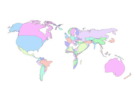
Click the image to view it a little larger. This map represents the world in relation to food consumption. The places where food consumption is higher than normal are proportionally swollen, and the places where it is lower are shrunken:
Surprise! We eat a lot, and Africans don't. Now go enjoy your lunch, fatass.
Surprise! We eat a lot, and Africans don't. Now go enjoy your lunch, fatass.
Subscribe to:
Post Comments (Atom)


No comments:
Post a Comment